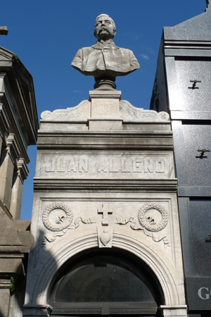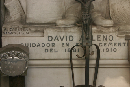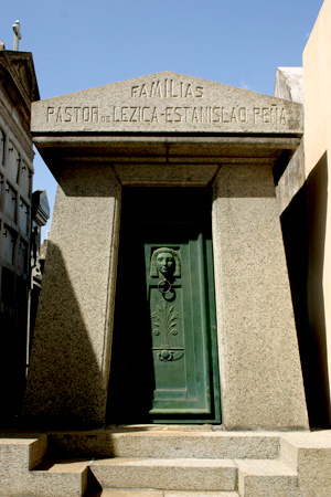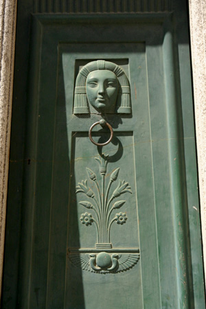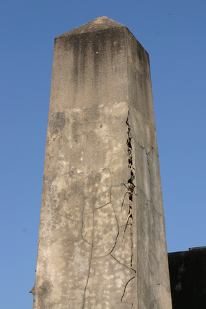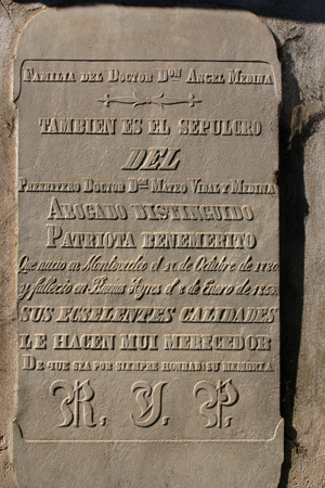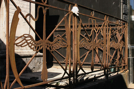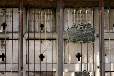
Although this skinny, narrow mausoleum doesn’t stand out, an urban legend lurks inside. Peek through the door to find the sculpture of David Alleno—caretaker in Recoleta Cemetery from 1881 to 1910.
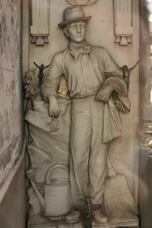
Like the caretakers of today, David had a certain sector which he maintained & apparently became obsessed over where his final resting place would be. Members of the Alleno family claim that David’s brother, Juan, had already purchased this plot for his family… perhaps that inspired David to be buried in Recoleta Cemetery as well. After saving over a lifetime, he was able to have a sculpture made of himself at work, complete with keys, broom & watering can:


Urban legend claims that when the sculpture arrived from Italy & was placed in the tomb, David was so eager to complete the project that he went home & committed suicide… knowing that he would soon rest in peace here. Whether the motive is true or not, David Alleno is now locked in with the elite residents of Recoleta Cemetery:

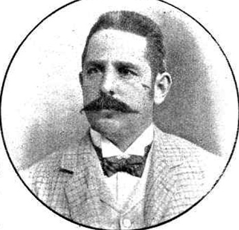
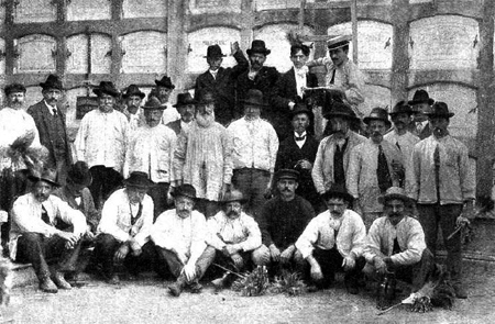
Update (07 Nov 2010): Thanks to an investigation by Guada Aballe, we know a few more facts about the life of David Alleno… & she found photos too! One of the best resources for early 20th century Buenos Aires history is Caras & Caretas, a local magazine with political & social commentary. In the 10 Apr 1909 edition, Recoleta Cemetery workers were concerned about a change in administration. Various caretakers were photographed & David Alleno appeared in the article:


David Alleno spent 28 years working at Recoleta Cemetery & according to his death certificate—also amazingly uncovered by Guada—he passed away on 31 Aug 1915. The cause of death is listed as “trauma & cerebral contusion.” Of course whether or not the head injury was self-inflicted does not appear on the death certificate. But we’re one step closer to uncovering the truth behind the urban legend. Thanks, Guada!!
