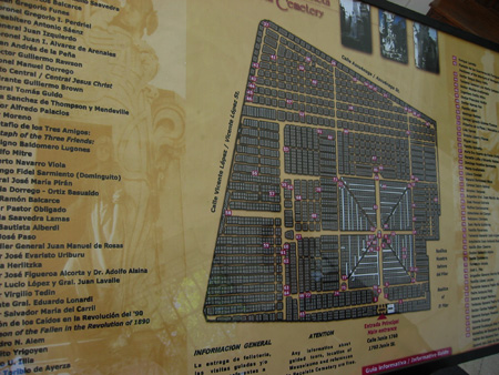
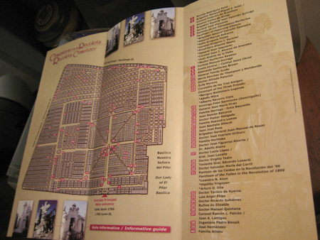
A few months later in November 2003, the hand-drawn map had been replaced with a more professional version. 89 locations (4 more than the first map) were marked to visit:

By either being lucky or a regular enough visitor, one day I was given a free handout which was a tri-fold reproduction of the map at the entrance gate:

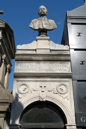
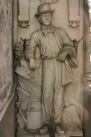
Initially pleased at having a free guide to the cemetery, the design was remarkably amateur… for example, the map had been scanned at a very low resolution & enlarged. Pixels were glaringly obvious & angles were badly rendered. Note that there are two sets of three photos each on the map. The two sets are exactly the same. Could they not come up with six original photos for the brochure?
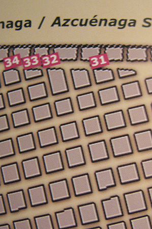
Design issues aside, the map turned out to be less than useful. In the pic below, what spot does #31 belong to? On the map it overlaps three squares, but in reality some of those blocks are subdivided. It took a bit of work to use the free handout:

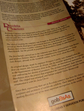
A brief history was poorly translated on the back of the pamphlet. Read for yourself:

Don’t get me wrong… I’m not trying to slam the city government’s efforts. The problem is that at the same time they were producing wonderfully designed brochures to promote other areas of development within the city. Cutting-edge design & attention to detail was what I’d come to expect. So for the most-visited tourist site in Buenos Aires, I expected something much better than what was produced.
Only a few months before this map was issued, I began my walking tours in Buenos Aires. One of the walks offered was of the Recoleta neighborhood, & we ended with a quick stroll through the cemetery. I wasn’t sure if the tours would be successful, but I was certain that Recoleta Cemetery could be better promoted.
Read the complete story in the following posts titled “map development”: Part 1, Part 3, Part 4, Part 5, Part 6 & Part 7. Good news! The PDF guidebook is now available.
